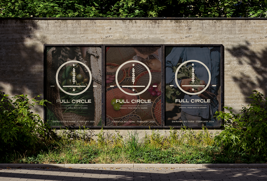
“Full Circle” was a conceptual festival identity created for Emirates Bio Farm, centred around themes of sustainability, nourishment, community, and the journey of food from seed to shared table. My role focused primarily on developing the visual identity, logo direction, key visuals, and overall creative language of the project, shaping a world that felt warm, grounded, and deeply connected to the rhythms of nature. Inspired by agricultural cycles, organic textures, and the emotional familiarity of gathering around food, the identity aimed to balance refinement with authenticity through a contemporary yet earthy visual approach.
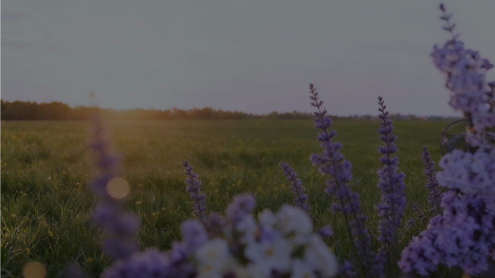
Before the crowds arrive, the fields hold their breath.
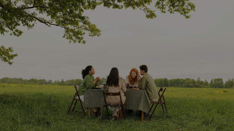
The land waits , for footsteps, for laughter, for voices carried on the breeze.
It waits for the moment when people return to the source of their food, and to one another.

And in that moment, the farm becomes more than land, it becomes a complete journey.
A path that begins with a seed and ends at a shared table, only to begin again.

Real capability reveals itself in natural environments, not controlled demonstrations,
where conditions shift and authenticity matters.
THE PHILOSOPHY
The concept was created around the idea that the journey of food is a continuous cycle of growth, nourishment, sharing, and renewal. The philosophy centred on reconnecting people to the origins of what they consume, from the soil and the farmers who cultivate it, to the meals shared around the table. The name " Full Circle" reflects both the natural rhythms of agriculture and broader ideas of sustainability, regeneration, and community, positioning the festival as a celebration of connection: between people and land, producer and consumer, tradition and future. Designed to feel familiar, grounded, and universally resonant, the concept aimed to create an experience rooted in authenticity, togetherness, and a return to simpler, more conscious ways of living.
THE VISUAL LANGUAGE
The Full Circle visual direction embodies the rhythm of the land: unhurried, grounded, and deeply human.
It leans into earthy warmth and natural imperfection, allowing the visuals to feel lived-in rather than manufactured.
Colors are softened, sun-washed, and comforting; imagery is intimate and tactile, always showing real hands, real harvests, real textures. The symbol sits with quiet confidence, never shouting, always integrating seamlessly into the world around it, as if it, too, was grown rather than designed. Nothing feels excessive or ornamental; the identity trusts simplicity, negative space, and honesty to carry meaning. Overall, the system expresses a refined authenticity: high-end not through polish, but through restraint, coherence, and a deep respect for where things come from. It’s a visual world that feels warm, natural, and rooted, an invitation into a cycle of growth, connection, and shared nourishment.
THE INSPIRATION


THE LOGO
The Full Circle logo visually captures the journey “from seed to shared,” symbolizing the regenerative cycle of food and community. At its center, a stylized crop stem rises, flanked by a sun above and a seed below, framing the essential elements of farming.
The horizontal line becomes the soil’s horizon; the enclosing circle, a gesture of wholeness, continuity, and a shared plate.
Drawn with organic, gently imperfect lines, the mark carries an earthy calm: natural, human, and subtly alive.
Its contours feel hand-made rather than manufactured, giving the symbol warmth and presence without noise.
That restraint is its power: simplicity becomes emphasis, negative space becomes breath, and the form reads instantly at any scale while rewarding a closer look. Paired with clean, understated typography whose curves and terminals feel natural and organic,
the lockup lands with confidence, rooted yet contemporary, an emblem of connection, process, and nourishment that invites people back to the table and back to the land.


THE PALETTE
Drawn from the field rather than the screen, this palette leans into toned-down harvest hues: an off-white that lifts layouts with clean light against an inky near-black; a warmer cream that reminiscent of hay, straw, and canvas, soft, tactile, sun-touched;
a muted olive that carries stems and leaves; and a deeper green-brown that anchors compositions with the sense of bark, wet soil, and shaded rows. These earth notes are lifted by tempered terracotta recalling clay pots and ripened fruit, and a slate-leaning indigo that brings the cool of dusk and water. Nothing is primary or over-saturated, each tone feels hand-mixed and slightly weathered, so type stays legible and photography breathes. Collectively, the palette embodies balance and continuity:
light and shade, warmth and calm, growth and ground, supporting the Full Circle story of a journey shared.

THE APPLICATION